
“It’s Just a Different Shade of Blue… Right?”
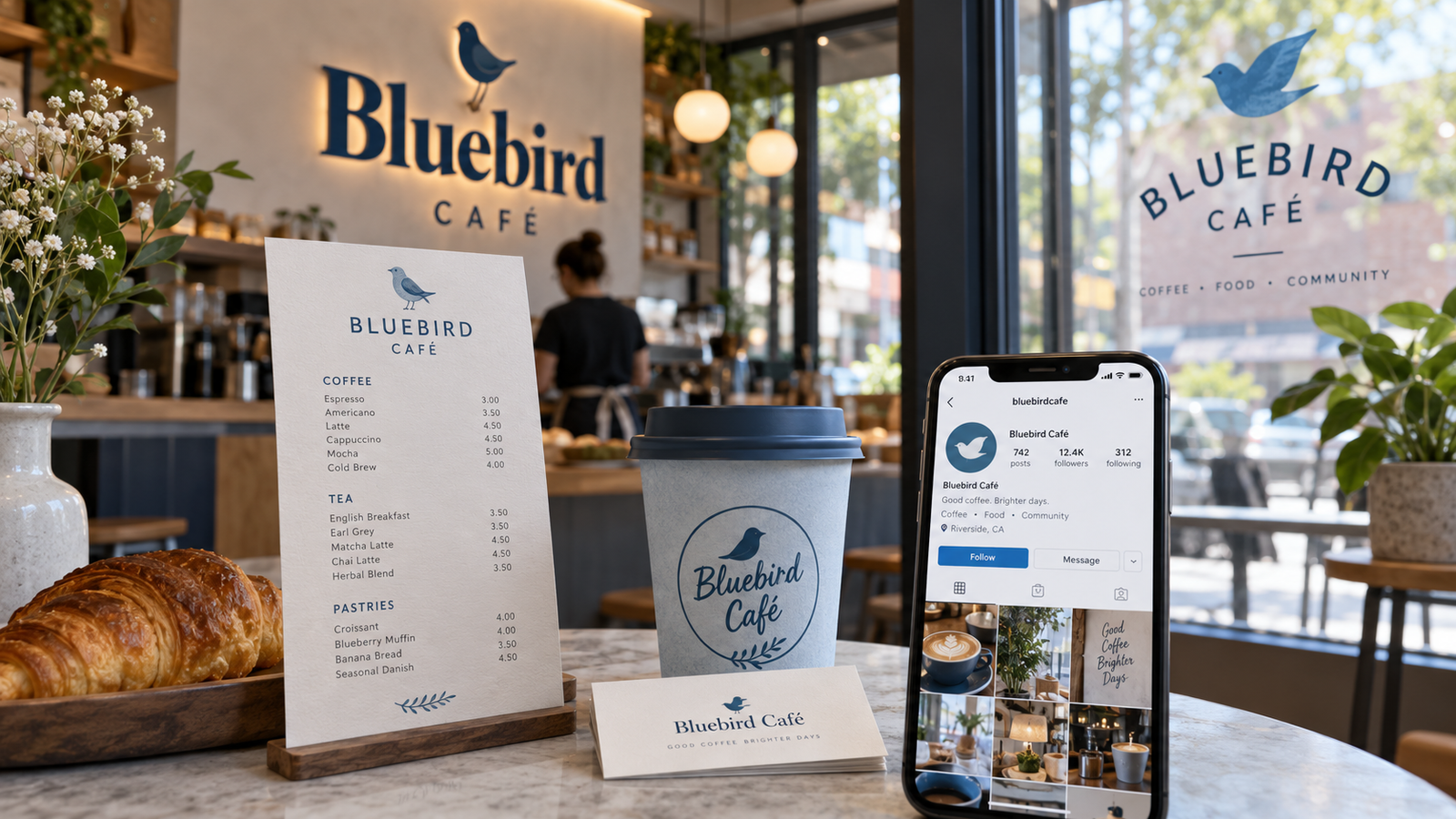
We see this more often than you might think.
You spot a business advertisement on social media and it looks great. Clean design. Nice colours. Professional logo.
Then you click through to the website.
The logo looks a little different.
The blue is suddenly… bluer.
The font has apparently gone on its own personal journey.
Then you visit the business in person and discover the storefront sign looks like it belongs to yet another version of the company.
And just when you think you’ve solved the mystery, someone hands you a business card that looks completely different from everything else.
Now you’re not looking at a brand.
You’re looking at a family reunion where nobody got the memo about the dress code.
Believe us, we understand how this happens. We’re currently working on updating some of our own signage after our business name changed a few times over the past several years. Branding can evolve. Businesses change. Old materials hang around longer than expected.
The problem begins when all those different versions start appearing at the same time.
Inconsistent branding can make a business harder to recognize, less professional, and more expensive to manage.
If your customers are confused about who you are, it becomes harder for them to remember you, recognize you, and ultimately trust your business.
So why does inconsistent branding happen, what does it cost, and how can you fix it?
The first thing to understand is this:
Brand inconsistency rarely looks catastrophic in one place. The damage comes from repetition.
What Does “Inconsistent Branding” Actually Mean?
According to Technadigital.com, inconsistent branding refers to a lack of uniformity in how a brand presents itself across different channels, touchpoints, and communications.
That inconsistency can appear in many ways, including changes in logos, colours, messaging, photography, and tone of voice.
Over time, this can create confusion, weaken brand recognition, and make it harder for customers to build familiarity and trust.
Some common examples include:
- different logo versions used randomly
- colours that shift from piece to piece
- changing fonts
- inconsistent tone of voice
- mismatched photography or graphics
- signs, menus, packaging, and social media that do not feel connected
- old branding continuing to circulate after a refresh
One slightly wrong colour probably won’t bring civilization to an end.
But when every customer touchpoint looks a little different, the problem starts adding up.
Cost #1: You Become Harder to Recognize
Repetition builds familiarity.
If your logo, colours, fonts, and overall style remain consistent, customers begin to recognize your business without having to think about it.
That’s exactly what you want.
But if your visual identity keeps changing, customers have to work harder to connect the pieces.
Your storefront might look different from your website.
Your Facebook post might not resemble your menu.
Your flyer might look as though it came from a completely different company.
Individually, those differences may seem minor. Together, they weaken the visual memory you’re trying to build.
Your signage has less impact.
Your advertising feels disconnected.
Your social posts become harder to recognize at a glance.
And your brand becomes less memorable.
Recognition is built through repetition, not reinvention.
Cost #2: It Can Make the Business Feel Less Professional
Most customers are not going to walk into your business and announce:
“Excuse me, but your typography system appears to lack visual consistency.”
At least, we hope not.
They probably won’t consciously identify the problem at all.
Instead, they may simply feel that something seems off.
Does the business look unfinished?
Is the company new?
Are these materials outdated?
Do these signs actually belong to the same business?
That uncertainty can affect how professional and established the business feels, even when the customer cannot explain exactly why.
Good branding often works quietly.
So does bad branding.
Cost #3: You Waste Time and Money Recreating Things
Brand inconsistency doesn’t just affect customers. It creates headaches behind the scenes too.
Your staff may not know which logo to use on a letterhead, presentation, email signature, or social post.
Someone needs the company green, but nobody knows the actual colour value.
So they eyeball it.
Close enough, right?
Then somebody else eyeballs it six months later.
Now you have three greens.
Without a basic brand guide, every new project requires someone to make decisions that should already have been made.
Every flyer starts from scratch.
Every social graphic becomes a mini design exercise.
Every menu needs to be reworked to match the latest version of the brand.
Then there’s signage.
Signage can be expensive, and a mistake involving the wrong logo, colour, font, or artwork can become very expensive very quickly.
Sometimes an old file gets used simply because nobody knows which version is current.
Without a clear brand system, every project becomes a mini redesign.
That costs time.
And time, irritatingly, continues to insist on being money.
Cost #4: Print Problems Get Expensive Fast
This is where inconsistent branding can become particularly painful.
Different vendors may receive different artwork.
At Circle Creatives, we proof artwork back to our customers before production to help make sure everything looks correct. Not every production process works that way, though, and sometimes what gets submitted is exactly what gets printed.
If the wrong file goes in, the wrong file may come back out.
In several hundred copies.
There can also be differences between artwork created for screens and artwork created for print.
As we discussed in our previous post, screens typically use RGB colour, while commercial printing generally uses CMYK.
Colours that look bright and vibrant on a monitor may shift when converted for print.
That beautiful electric blue on your website may return from the printer having experienced a small existential crisis.
Then there’s resolution.
Images that look perfectly acceptable on a screen may not contain enough detail for high-quality printing. A low-resolution image can appear blurry, jagged, or pixelated when enlarged.
And yes, even black can cause trouble.
The K in CMYK stands for Key, which represents black. Standard black text is often printed using the black channel alone.
Then there is rich black, which combines black with additional cyan, magenta, and yellow.
Rich black can create a deeper-looking black in certain applications, but it isn’t appropriate everywhere. Small text made from several overlapping inks can sometimes become less crisp depending on the production method.
Because apparently even black decided one version of itself wasn’t enough.
Then add:
- incorrect finished sizes
- missing bleed
- poor trim margins
- inconsistent colour values
- outdated logos
- incorrect image resolution
Suddenly a seemingly tiny branding problem has turned into revisions, delays, reprints, additional setup costs, and a very unhappy pile of paper.
Cost #5: Your Team Makes More Decisions Than It Should
Brand Consistency Is Also a Workflow Tool
A brand guide is not just about making things look pretty.
It also removes unnecessary decisions.
Without brand standards, your team may repeatedly ask:
- Which logo do I use?
- Which font is correct?
- What shade of green is this?
- Are we formal or casual?
- Which version of the menu is current?
- Do we have a high-resolution logo?
- Is this the new file or the old-new file?
You know the one.
Logo_FINAL_v7_USE-THIS-ONE-REALLY.ai
A simple brand system answers those questions before they need to be asked.
That makes work faster, reduces mistakes, and gives employees and vendors something reliable to follow.
Cost #6: Growth Gets Messier
One of the biggest hidden costs of inconsistent branding is that inconsistency multiplies as your business grows.
A single storefront might get away with a few informal decisions.
Then you add:
- a second location
- more employees
- multiple printers or vendors
- social media
- packaging
- uniforms
- signage
- digital menus
- advertising
- online ordering
Now every small inconsistency has more places to spread.
It’s basically the branding version of glitter.
Once it gets everywhere, good luck finding all of it.
The earlier you establish standards, the easier it becomes to keep everything under control as the business grows.
What Consistency Does Not Mean
Brand consistency does not mean every piece of marketing has to look identical.
It does not mean creativity disappears.
It does not mean every layout uses the same template forever.
And it definitely does not mean your brand can never evolve.
Consistency simply means that everything speaks the same visual language.
The colours feel related.
The typography belongs together.
The imagery makes sense.
The tone sounds like the same company.
The logo is used correctly.
There is a recognizable family resemblance.
Think of it less like wearing the exact same outfit every day and more like having a recognizable wardrobe.
Different outfits.
Same person.
The Fix: Build a Simple Brand System
The good news is that inconsistent branding does not automatically mean you need to throw everything away and start again.
Sometimes the pieces are already there.
They just need organizing.
A basic brand style guide can define things such as:
- primary logo
- alternate logo
- colour palette
- CMYK, RGB, and HEX colour values
- fonts
- logo spacing and usage
- image style
- tone of voice
- approved templates
For businesses with regular printing needs, it can also help to maintain:
- vector logo files
- high-resolution raster files
- black-and-white logo versions
- CMYK artwork
- Pantone references where required
At Circle Creatives, we can work with you to organize those elements into a clear system your staff, designers, printers, and other vendors can actually use.
Because a brand guide should not be a beautiful PDF that disappears into a mysterious folder somewhere.
It should make your life easier.
Quick Brand Consistency Check
Not sure whether your brand has started wandering off in several directions?
Compare your:
- website
- storefront
- business card
- social media profiles
- menu
- packaging
- flyers
- signage
Then ask:
- Does the logo match?
- Do the colours match?
- Are the fonts consistent?
- Does the tone feel like the same company?
- Does the photography or imagery feel connected?
- Would a customer immediately recognize all of these as belonging to the same business?
If your answer to several of those questions is:
“Well… technically…”
you may have found the problem.
Consistency Saves More Than It Costs
A consistent brand builds recognition, reduces confusion, improves professionalism, speeds up production, reduces rework, and makes future growth easier.
More importantly, it gives everyone involved with your business a clear visual system to work from.
Customers know who they’re dealing with.
Employees know which files to use.
Printers know what colours are correct.
Designers know what belongs.
And nobody has to search through seventeen versions of the logo wondering which one was approved in 2022.
If your branding has grown a little wild over time, that doesn’t necessarily mean you need a complete rebrand.
Sometimes you just need to gather the pieces, decide what stays, retire what doesn’t, and create a system that works.
Your brand should evolve with your business.
It just shouldn’t look like five different businesses while doing it.